These infographics should spark some ideas among vendors and among shoppers:
infographics
DATA + DESIGN A simple introduction to preparing and visualizing information
A free online book to data visualization by the creators of Infoactive. I am proud to be a Kickstarter backer of this innovative company and hope we can lure them into the farmers market/food system world of data collection. This book came out of that campaign and-well, maybe just read what the author said about how the book came to be:
“It started with a message on Kickstarter:
Hi Trina! Stats dork from Chicago here….Do you have any plans to include tutorials for basic data cleaning and data selection techniques for users who may not have any statistics background?
At the time, I didn’t know that this one message would turn into a book, a community, and a global endeavor to make information design more accessible.
The message author, Dyanna Gregory, was a statistical programmer who knew the challenges of teaching university-level stats to those who don’t identify as math nerds. I was an entrepreneur building Infoactive, a web application to help people create interactive infographics and data visualizations. I was also a Reynolds Fellow at the Donald W. Reynolds Journalism Institute where my goal was to find ways to simplify the process of making data visualizations in newsrooms. I had launched a Kickstarter campaign to support Infoactive, and we had nearly 1,500 backers who were excited about breaking down barriers in data visualization.
We all believed in the vision of making data simple.
But working with data can be far from simple. Data come in all different shapes, sizes, and flavors. There’s no one-size-fits-all solution to collecting, understanding, and visualizing information. Some people spend years studying the topic through statistics, mathematics, design, and computer science. And many people want a bit of extra help getting started.”
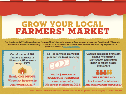
Wisconsin farmers market graphic on benefit program usage
Professor Alfonso Morales, principal investigator to the Indicators for Impact project sent this interesting graphic to the project team last week:
PDF
here is the top part for those unable to see the PDF:
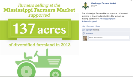
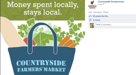
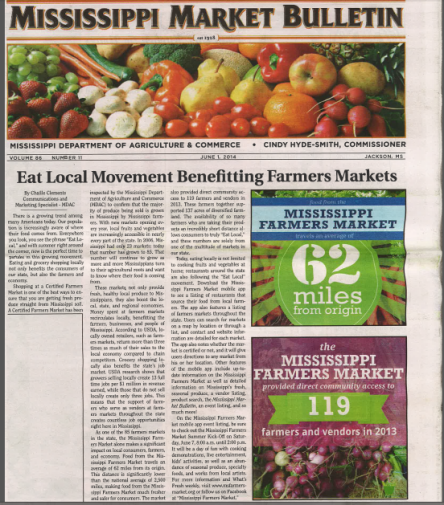
Using infographics to tell a story about multiple benefits is rapidly growing throughout the farmers market field and the Farmers Market Coalition Farmers Market Metrics project (including the Indicators for Impact research) has already devised prototypes of reports and graphics for markets which will continue to be refined. Here are some examples of how some of the FMM/FMC prototype markets have already used the graphics on FB and in print too: